
Digital Design and Printing – The Perfect Storm for Over-Design
As an architect, I learned early on that too much design or “over-design” is often the easy way out. The really difficult solutions and, more often than not, the best designs are the result of meticulous and thoughtful efforts to simplify the end result to the barest and, hopefully, most elegant solutions. In my opinion, this generally applies to all forms of design: architecture, graphic design, industrial design and so on.
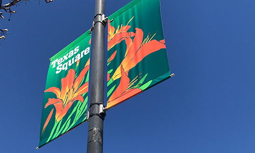
After 25 years experience with our Kalamazoo Banner Works line of vertical street pole banners we’ve seen about every possible graphic design format possible for a vertical piece of fabric 30″ wide by 94″ long (our largest typical size) – from refined, effective and striking to graphics of mass confusion that are virtually unreadable. And, it seems, the confusing ones are becoming more common.
Let me explain. These banners are the ones that you see mounted on city light poles, among other places, that more and more cities install to show “pride of place”, announce events and celebrate holidays. When we began designing, manufacturing and marketing these types of banners back in 1983, it was and still is our goal to have the banners, which we design, be simple, bold, readable and pleasing to the eye. What we try to avoid is a look that might remind one of the typical “billboard” similar to what you see on the side of major highways where there is plenty of space to say more than you need to know. Urban light pole banners are best when the design is simpler, bolder and more striking and, I feel, should provide color and interest and enough information to make someone want to know more. We don’t look at the banner as the only element to a program’s communication needs. This just is not the medium for “everything you need to know”. There plainly is not room on a narrow banner nor is too much copy nor are complex photo images easy to read or understand when driving by at 30-plus miles per hour.
Through the years, our clients have tended to agree with our concept as their primary goal is to “dress up” their streets and venues and provide color and the type of design that would be more appropriate in the typical urban setting. This look for which we strive might be described as a sort of anti-billboard (of course, I understand that I may be accused of arbitrarily condemning all billboards, when some may be deemed acceptible) and as soon as it looks like a particular design might be approaching the billboard look we caution the client and present our advice to simplify, if possible.
Our “purist” approach, I believe, had initially helped to make the idea of urban street graphics palatable and popular. The challenge right now, however, with the amazing capabilities provided by digital design and digital printing, has provided designers the “perfect storm” for overdesign. It’s just too easy nowadays to throw images together and shade and screen and half-tone and impose image on image until every trick in the book appears on the banner concept. The end result is often unreadable and difficult to understand. I firmly believe that one of the most significant reasons that urban street banners became accepted by city planners and marketers was their inherent simplicity. This simplicity occured somewhat naturally because the only methods of manufacturing them were via screen printing and appliqué. These methods, back in 1970 to 2000, were either the only reasonable way to construct the banners or were certainly the most cost effective. Digital printing of banners did not become cost effective until after 2000. That’s when designers began to feast on the wonders of digital tools and apply more design elements than are sometimes necessary.
So, my message here is the same one that architect Ludwig Mies van der Rohe made popular: Less is More. Or, others might refer to it as K.I.S.S.